Displaying product recommendations with the Recommendation Shelf
Display a carousel of personalized product recommendations from a VTEX Recommendations campaign on any page or inside the cart drawer, configured entirely through the CMS.
9 min read
This feature is in beta. If you have questions about enablement, account configuration, or campaigns, contact our Support team.
In this guide, you'll learn how to enable, configure, and add the Recommendation Shelf to a FastStore storefront. The Recommendation Shelf is a native FastStore section that displays a carousel of personalized product recommendations from a VTEX Recommendations campaign. Depending on the campaign configuration, the shelf can show recommendations such as cross-sell products, similar items, or top sellers.
The section uses the same product cards as other shelves in your store, keeping the appearance of recommended products consistent across the storefront. It's also a global CMS component, so you can add and configure it on any page through the CMS, including more than one shelf per page.
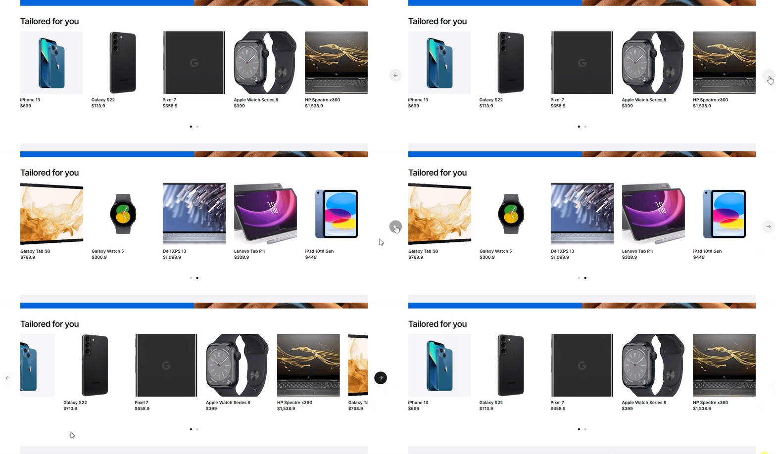
Recommendations can be displayed on two surfaces, both powered by the same VTEX Recommendations campaigns:
| Surface | Layout |
|---|---|
| Recommendation Shelf | Full-width carousel |
| Mini cart shelf | Compact carousel inside the cart drawer |
This guide covers the native Recommendation Shelf section, which is the recommended way to display recommendations in a FastStore store. Follow Integrating product recommendations in headless or FastStore web stores only if you're building a custom headless storefront or a fully custom recommendation experience that calls the Recommendations API directly instead of using this section.
Before you begin
Make sure you have:
- A FastStore store connected to the CMS.
- Approval to use the product recommendations feature for your account. To request it, open a ticket with VTEX Support.
- Activity Flow available in your store, if you want to track recommendation impressions, views, and clicks. Activity Flow is optional but recommended, and FastStore includes it natively. If tracking events don't appear, confirm that Activity Flow is active and that the shelf's tracking attributes are rendered.
- At least one active recommendation campaign.
Instructions
Step 1: Get the campaign VRN
The VRN (Virtual Resource Name) identifies the recommendation campaign the shelf displays. It follows this pattern:
_10vrn:recommendations:{accountName}:{campaignType}:{campaignId}
Example:
vrn:recommendations:apiexamples:rec-persona-v2:123e4567-e89b-12d3-a456-426614174000.To get the VRN, follow these steps:
- In the VTEX Admin, go to Storefront > Recommendations.
- In the shelf list, select the campaign you want to display.
- Click the three dots on the right side of the shelf and then click Copy ID.
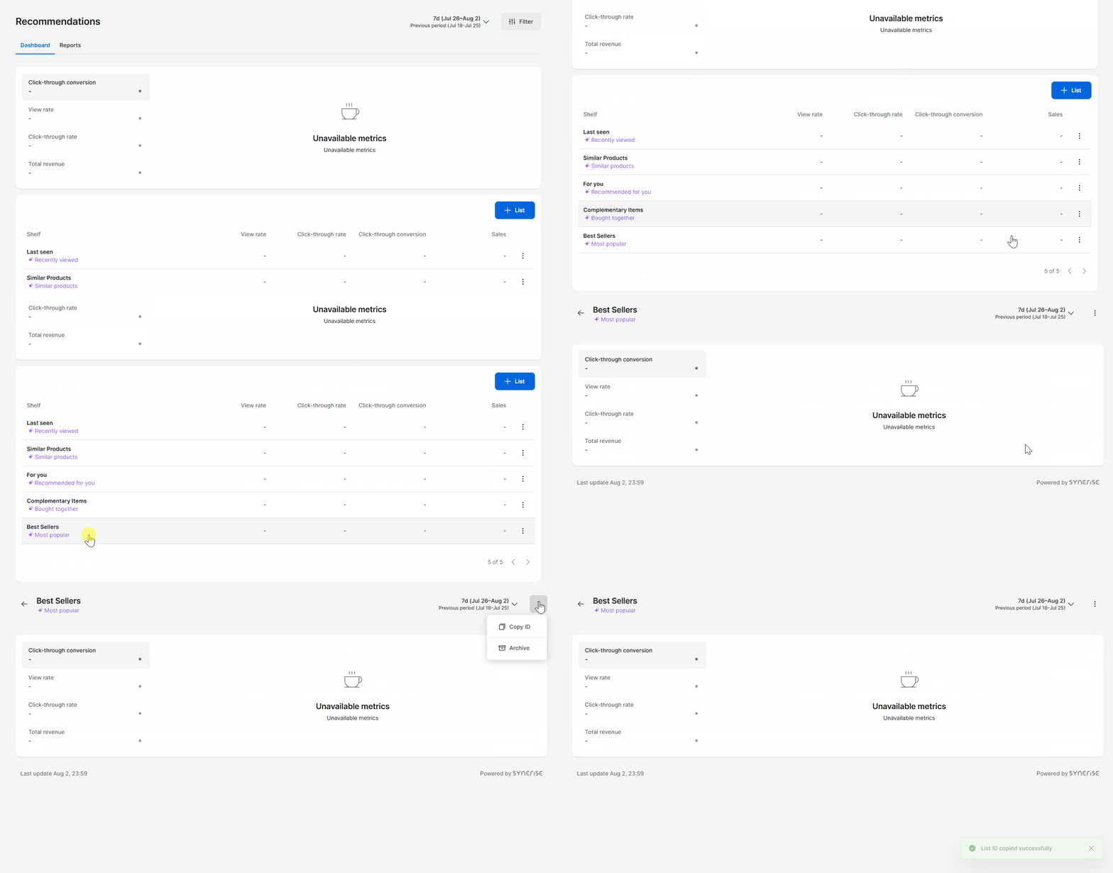
For the list of supported campaign types, see Campaign types and product context.
Step 2: Add and configure the section in the CMS
- In the VTEX Admin, go to Storefront > Content > All Content and open the page where you want to display the shelf, such as the Homepage, a Product Details Page (PDP), or a Product Listing Page (PLP).
- Click Add Section and select Recommendation Shelf.
- Turn on the Enable recommendations? toggle switch. This field is disabled by default, and the shelf doesn't fetch or render anything while the field is disabled.
- Paste the campaign VRN from Step 1 in the Campaign VRN field. This field is required.
- Configure the remaining fields as needed. See Section fields.
- Save and publish the page.
You can add more than one Recommendation Shelf to the same page. Repeat the steps above for each shelf and give each one its own campaign VRN, for example, to display cross-sell and similar-item shelves on the same product page.
Section fields
The Recommendation Shelf is a native, global section, so there's no schema to create: it ships with
@faststore/core, and you configure it directly through the CMS form. The table below lists all available fields. Only the Campaign VRN is required; the remaining fields are optional and fall back to their default values. Fields prefixed with › are nested inside the Carousel Configuration and Product Card Configuration groups.| Field | Key | Type | Required | Default | Description |
|---|---|---|---|---|---|
| Enable recommendations? | enableRecommendations | boolean | No | false | Opts the store into the personalization session and allows this shelf to fetch recommendations. While off, no session starts and the shelf renders nothing. |
| Title | title | string | No | — | Overrides the shelf title. When empty, the campaign title is used. If both are empty, no heading is rendered. |
| Campaign VRN | campaignVrn | string | Yes | — | The recommendation campaign VRN. Validated against the pattern described in Step 1. |
| Items context | itemsContext | PDP | CART | No | PDP |
| Carousel Configuration | carouselConfiguration | object | No | — | Carousel settings. |
| Items per page (desktop) | itemsPerPageDesktop | number | No | 4 | Items per page on desktop. |
| Items per page (mobile) | itemsPerPageMobile | number | No | 2 | Items per page on mobile and tablet (≤ 768px). |
| Carousel track variant | variant | slide | scroll | No | scroll |
| Infinite navigation? | infiniteMode | boolean | No | false | Enables infinite navigation. Applies only to the slide variant. |
| Navigation controls | controls | complete | navigationArrows | paginationBullets | No |
| Product Card Configuration | productCardConfiguration | object | No | — | Product card settings. |
| Show discount badge? | showDiscountBadge | boolean | No | true | Shows the discount badge on cards. |
| Cards should be bordered? | bordered | boolean | No | true | Renders bordered cards. |
Customizing the section
Most stores configure the shelf entirely through the CMS, using the Section fields. If you need to go beyond those fields — for example, to render a custom product card or change how each recommended product maps to card props — customize the section in code through FastStore's override system. See Section override to customize a native section, or Creating a new section to build your own. CMS configuration takes priority over code-based overrides.
Beyond the CMS fields, the component accepts two code-level props that aren't exposed in the CMS schema:
ProductCard: A custom card component. Defaults to the coreProductCard.mapProductToProductCard: Maps each recommended product, a normalizedStoreProduct, into card props. When you provide this function, it fully owns the card props and the defaultproductCardConfigurationmerge no longer applies.
The following example illustrates these props.
_14import { RecommendationShelf } from 'src/components/sections/RecommendationShelf'_14_14<RecommendationShelf_14 enableRecommendations_14 campaignVrn="vrn:recommendations:my-account:rec-cross-v2:abc123"_14 itemsContext="PDP"_14 ProductCard={MyCustomCard}_14 mapProductToProductCard={(product, index) => ({_14 product,_14 index,_14 highlight: index === 0,_14 })}_14 carouselConfiguration={{ itemsPerPageDesktop: 5, variant: 'slide' }}_14/>
The exact integration depends on your override setup.
Campaign types and product context
FastStore derives the campaign type from the
{campaignType} segment of the VRN. Some campaign types require a product context, meaning the shelf needs one or more anchor products to generate recommendations.| Campaign | VRN segment | Requires product context |
|---|---|---|
| Cross-Sell | rec-cross-v2 | Yes |
| Similar Items | rec-similar-v2 | Yes |
| Visual Similarity | rec-visual-v2 | Yes |
| Next Interactions | rec-next-v2 | Yes |
| Personalized | rec-persona-v2 | No |
| Top Sellers | rec-top-items-v2 | No |
| Last Seen | rec-last-v2 | No |
| Search-Based | rec-search-v2 | No |
The Items context field determines which products are used as context:
PDP(default): uses the product on the current product detail page. Outside a PDP, there's no product context.CART: uses the products currently in the cart, deduplicated. This is intended for cross-sell shelves on the cart page.
Campaigns that require product context skip the request when no context products are available — for example,
PDP context on a page that isn't a product page, or CART context with an empty cart. This avoids returning recommendations without an anchor, and the shelf renders nothing in that case. Campaigns that don't require context ignore the Items context field.Recommended placement
Because the shelf is a global component, you can add it to any CMS page. We recommend matching the placement to the campaign type:
| Page | Recommended campaigns | Items context |
|---|---|---|
| Home and institutional pages | Top Sellers, Personalized, Last Seen, Search-Based | Not applicable |
| Product details pages | Cross-Sell, Similar Items, Visual Similarity, Next Interactions | PDP |
| Cart page | Cross-Sell | CART |
| Product listing pages | Top Sellers, Personalized, Last Seen, Search-Based | Not applicable |
Displaying recommendations in the mini cart
The mini cart shelf displays a compact recommendation carousel inside the cart drawer, between the cart items and the order summary. Because the shopper has just added a product and the drawer is already open, this is the store’s highest-intent cross-sell surface.
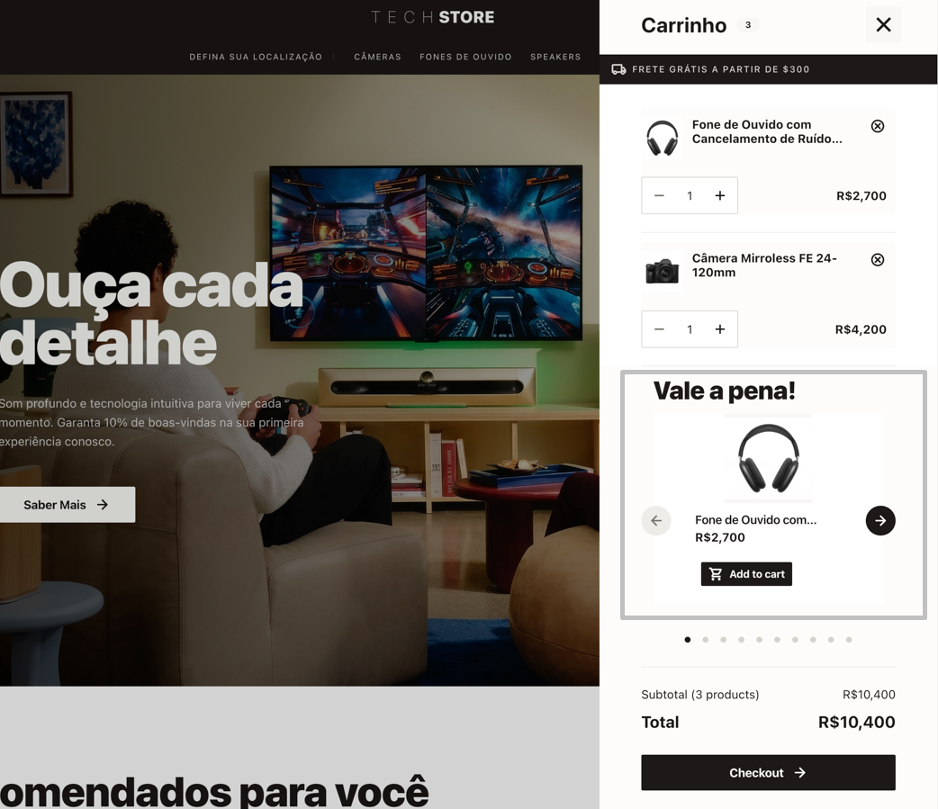
Compared to the page shelf, the mini cart shelf always uses the cart as its context and updates as shoppers add items:
- It inherits the Cart Sidebar’s tax configuration.
- Doesn't render when the cart is empty, even for context-agnostic campaigns.
- Allows shoppers to add recommended products without closing the drawer.
- It's bundled in its own chunk so that stores with the feature disabled do not download its code or styles.
The mini cart shelf reuses the same Recommendations infrastructure as the Recommendation Shelf. Follow Before you begin and Step 1: Get the campaign VRN before enabling it.
Step 1: Enable the shelf on the Cart Sidebar component
- In the VTEX Admin, go to Storefront > Content > All Content.
- Open the Global Sections content type and select the Cart Sidebar component.
- Under Recommendations, turn on the Should display Recommendation Shelf? toggle switch. This field is off by default, and the drawer doesn't fetch or render anything while it's off.
- Paste the campaign VRN from Step 1 in the Campaign VRN field.
- Configure the remaining fields as needed. See Mini cart shelf fields.
- Save and publish.
Mini cart shelf fields
The table below lists the fields available under the Recommendations group of the Cart Sidebar component. Only Should display Recommendation Shelf? has no dependency. Campaign VRN is required for the shelf to fetch anything once the toggle is on, but isn't enforced by the CMS so the field can be left empty while the shelf is off.
Fields prefixed with›are nested inside the Carousel Configuration and Product Card Configuration groups.
| Field | Key | Type | Required | Default | Description |
|---|---|---|---|---|---|
| Should display Recommendation Shelf? | shouldDisplayRecommendationShelf | boolean | No | false | Opts the cart drawer into fetching and rendering the shelf. While off, there's no personalization session, no request, and nothing rendered. |
| Title | title | string | No | — | Overrides the shelf title. When empty, the campaign title is used. |
| Campaign VRN | campaignVrn | string | No | — | The recommendation campaign VRN. Uses the same format and campaign types as the page shelf (see Campaign types and product context). Needed at runtime once the toggle is on; the drawer doesn't fetch without it. |
| › Items per page | carouselConfiguration.itemsPerPage | number | No | 1 | Products visible at once. The drawer is a fixed, narrow width on every breakpoint, so there's a single field instead of separate desktop/mobile counts. Fractional values, such as 1.5, hint that the carousel scrolls. |
| › Carousel track variant | carouselConfiguration.variant | slide | scroll | No | scroll |
| › Navigation controls | carouselConfiguration.controls | complete | navigationArrows | paginationBullets | No |
| › Show discount badge? | productCardConfiguration.showDiscountBadge | boolean | No | true | Shows the discount badge on cards. |
| › Cards should be bordered? | productCardConfiguration.bordered | boolean | No | false | Renders bordered cards. |
Customizing the mini cart shelf
The mini cart shelf accepts the same code-level overrides as the page shelf (
ProductCard and mapProductToProductCard; see Customizing the section). Because the drawer is rendered from the Cart Sidebar's CMS props, applying a custom card to the mini cart shelf means customizing the Cart Sidebar component in code through FastStore's override system, forwarding the override into the recommendations configuration.The shelf root also exposes a dedicated CSS hook,
data-fs-cart-recommendation-shelf, in addition to the data-fs-recommendation-shelf hook shared with the page shelf. Use it to style the drawer instance without affecting page shelves:
_10[data-fs-recommendation-shelf] {_10 /* page shelf and mini cart shelf */_10}_10_10[data-fs-cart-recommendation-shelf] {_10 /* mini cart shelf only */_10}