The Shipping Option Components app is available only for stores using Delivery Promise. This feature is currently in closed beta, meaning only select customers can access it. If you are interested in implementing it in the future, please contact our Support team.
For more information on setting up Delivery Promise components on Store Framework, see the developer documentation.
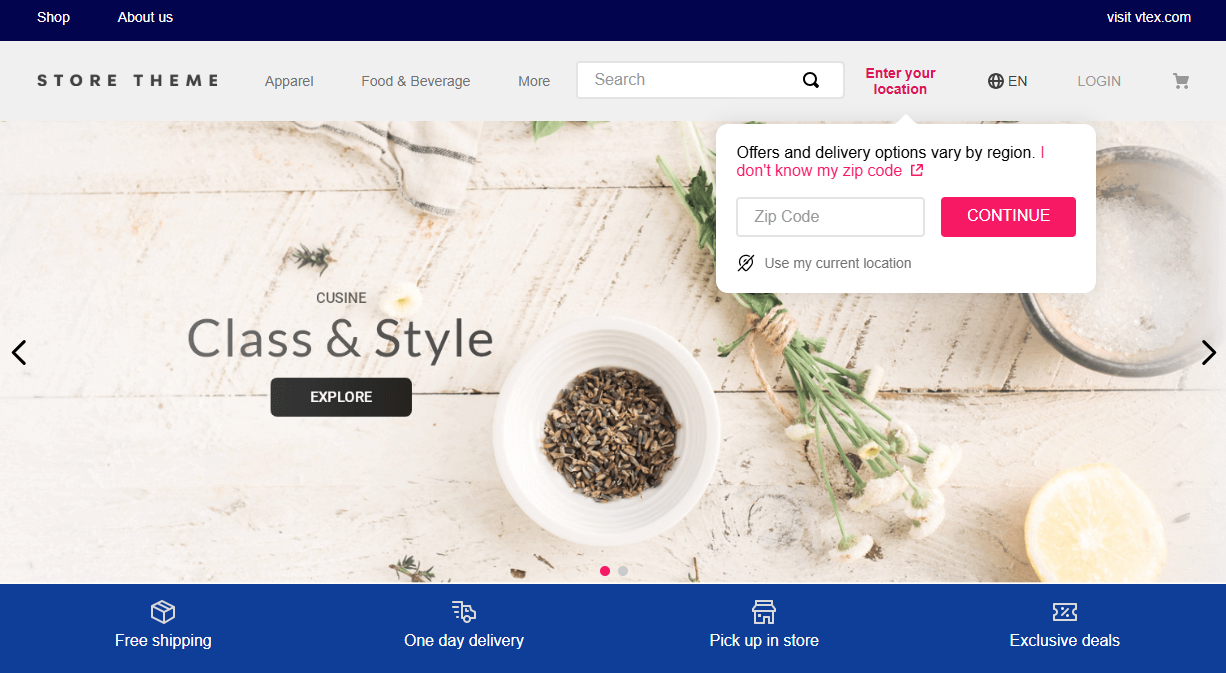
The Shipping Option Components app exports a component that allows you to filter store products by location or pickup point. Shoppers can share their location automatically (for example, through browser or device settings) or enter it manually.
Merchants can choose whether providing a location is optional or required. However, the shopper must provide their location for the Delivery Promise feature to work.
Configuration
Adding the Shipping Option Components app to your theme dependencies
Add the shipping-option-components app to your theme dependencies in the manifest.json as shown below:
_10 "dependencies": {_10 "vtex.shipping-option-components": "1.x"_10 }
You can now use all blocks exported by the shipping-option-components app. See the full list below:
| Block name | Description |
|---|---|
shipping-option-location-selector | Renders a set of components that allow users to add their location and/or select a store for pickup. |
Adding Shipping Option Components blocks to the theme
Declare the shipping-option-location-selector block as a child block of your header block, exported by the store-header app. Example:
_20"header.full": {_20 "blocks": ["header-layout.desktop", "header-layout.mobile"]_20 },_20_20 "header-layout.desktop": {_20 "children": [_20 "header-row#1-desktop",_20 ]_20 },_20_20 "header-row#1-desktop": {_20 "children": ["shipping-option-location-selector"],_20 },_20_20"shipping-option-location-selector": {_20 "props": {_20 "compactMode": true,_20 "showLocationDetectorButton": true_20 }_20},
shipping-option-location-selector props
| Prop name | Type | Description | Default value |
|---|---|---|---|
callToAction | enum | Defines the type of overlay that opens when the page loads. Possible values: modal (modal that requires a postal code input), popover-input (popover for postal code input), popover-button (popover that opens with a button). | popover-input |
compactMode | boolean | Determines whether the button displays its label. When true, the label is hidden, showing only its value. | false |
dismissible | boolean | Controls whether the modal can be dismissed without entering a postal code. When set to false, the modal can't be closed until a postal code is entered. Must be used along with callToAction to correctly set a blocking modal. | true |
shippingSelection | enum | Defines the type of shipping option selector to be displayed. Possible values: delivery-and-pickup (shows both options), only-pickup (shows only the pickup store selector) | delivery-and-pickup |
showLocationDetectorButton | boolean | When set to true, displays a location detector button that automatically detects the user's current location using geolocation API and sets the postal code based on their coordinates. The button appears both in the main component and in the location modal. | false |
Customization
In order to apply CSS customizations in this and other blocks, follow the instructions given in the recipe on Using CSS Handles for store customization.
| CSS Handles |
|---|
buttonLabel |
buttonValue |
buttonWrapper |
deliveryModalButtonLabel |
deliveryModalButtonLabelLimited |
deliveryModalButton |
deliveryPopover |
locationDetectorButton |
locationDetectorButtonContainer |
locationDetectorButtonIcon |
noPickupsStateContent |
pickupItem |
pickupItemSelected |
popoverInputContainer |
popoverPolygon |
popoverPolygonContainer |
popoverPolygonSvg |
postalCodeHelpLink |
postalCodeInputClearButton |
postalCodeInputContainer |
shippingButtonContainer |
shippingMethodModalOptions |
shippingOptionButton |
shippingOptionButtonSelected |